Client: Athar Accelerator
Project Scope: Brand Enhancement
Project Scope: Brand Enhancement
Project Overview
Athar Accelerator, dedicated to nurturing and scaling startups, aimed to enhance its brand identity while preserving its existing logo. The goal was to modernize and elevate the overall brand presence to increase visibility and appeal to a broader audience of entrepreneurs and investors.
Challenge
To enhance and update the Athar Accelerator brand while retaining the existing logo. The enhancement needed to refresh the brand identity, making it more dynamic and engaging without altering the core logo that the client wished to keep.
Brand Audit
After conducting a thorough review of the existing brand identity to identify areas for improvement.
Visual Identity Update
Focused on enhancing the brand’s visual identity through updated color palettes, typography, and design elements while keeping the existing logo intact.
Color Palette & Typography
Revamped the color palette and typography to create a more cohesive and modern look that complements the existing logo and enhances overall brand recognition.
Color Palette
The existing palette of Blue, Yellow, White, and Dark Grey was enhanced with the addition of Mint as an accent color, bringing a fresh, modern touch while maintaining the brand's professional and dynamic look.
Latin Typography
The typography was refined to ensure clarity and consistency across all brand materials.
Main Headings: Hepta Slab, using Hepta Slab Black for a bold and impactful look.
Subheadings: Hepta Slab Extra Bold to maintain visual hierarchy and emphasis.
Body Text: Manrope Font (Regular) for a clean and readable flow throughout the content.
This combination reinforced the brand’s modern and professional identity.
Arabic Typography
The Arabic typography was carefully selected to align with the brand’s modern and professional identity.
Main Headings: Jomhuria for a strong and distinctive presence.
Subheadings: Tajawal Bold to ensure emphasis and clear hierarchy.
Body Text: Tajawal Regular for readability and consistency across all content.
This choice of typefaces enhances the brand’s visual appeal and maintains coherence with the overall design.
Subheadings: Tajawal Bold to ensure emphasis and clear hierarchy.
Body Text: Tajawal Regular for readability and consistency across all content.
This choice of typefaces enhances the brand’s visual appeal and maintains coherence with the overall design.
Visual Elements
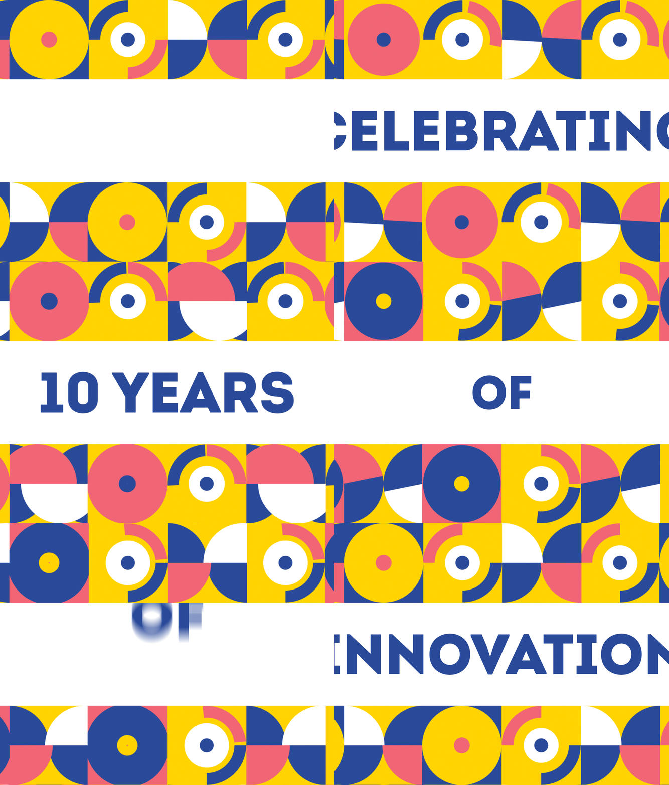
Introduced a custom pattern inspired by the logo, featuring connections, idea sharing, and the lotus flower from Upper Egypt. This pattern integrates seamlessly with the existing logo.
Brand Applications
The enhanced branding was applied across various touchpoints:
Business Cards, Roll-Ups, and Social Media Visuals (in both English and Arabic)
These applications ensure a cohesive and impactful brand presence across all materials.
Business Cards, Roll-Ups, and Social Media Visuals (in both English and Arabic)
These applications ensure a cohesive and impactful brand presence across all materials.


